Check your page on mobile in Elementor
Most of your visitors are on a phone. A page that looks great on your computer can be cramped, jumbled or unreadable on a small screen, and you won’t know unless you look. Elementor has a built-in way to look.
Switch to the mobile view
-
Open the page with Edit with Elementor.
-
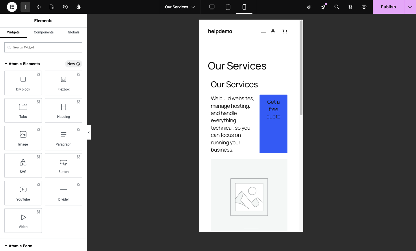
In the top bar, find the three device icons: desktop, tablet and phone. Click the phone icon.

The canvas narrows to phone width, showing the page roughly as a mobile visitor sees it.
-
Scroll the whole page top to bottom. You’re looking for text that’s too big, things squashed side by side, buttons that overflow, and images that lose their point when small.
Fix things just for mobile
Here’s the useful part: while you’re in mobile view, style changes you make apply to mobile only. The desktop page keeps its look.
-
Click the element that looks wrong. In its Style settings, adjust the size or spacing. The device selected in the top bar is the device your change applies to, so as long as you’re in phone view, you’re editing the phone look.

Typical mobile fixes: a smaller heading size, less padding on a section, and stacked rather than side-by-side columns.
-
Click Publish, then check the real page on your actual phone. The preview is close, but the real thing is the truth.
What to leave alone
Content changes (the words themselves, swapping an image) apply everywhere, on every device. Only style values (sizes, spacing, alignment) can differ per device. If you want different words on mobile, that’s a different technique, ask us.
A habit worth keeping
Any time you edit a page, give it ten seconds in the phone view before you publish. Mobile-first isn’t a buzzword; for most Australian small businesses it’s 60 to 80 percent of your real visitors.
Didn't work, or not sure?
No worries — that's what we're here for. Tell us what step you got up to and what you saw, and we'll sort it with you.